If you’ve ever approved a packaging design that looked perfect on screen—but disappointing in real production—you’re not alone.
Colors come out darker. Backgrounds look uneven. Images lose their sharpness.
In most cases, the issue isn’t your design.
It’s a lack of understanding of how flexo printing actually works.
At Noupack, we see this gap every day when working with brands and manufacturers. And it almost always comes down to one thing:
👉 The difference between solid printing and halftone printing.
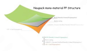
Solid vs. Halftone: The Foundation of Every Flexible Package
Every flexible package you see—whether it’s a coffee pouch, wet wipe sachet, or facial mask pack—is built using these two printing methods.
Solid Printing: Where Brand Identity Lives
Solid printing delivers full ink coverage—no dots, no patterns. Just clean, bold color.
This is what defines your brand on the shelf:
-
Logo colors
-
Background panels
-
Key visual blocks
If your solid color looks weak, patchy, or inconsistent, your product immediately feels low quality—no matter how good what’s inside is.
👉 Noupack Insight:
A strong brand color is not just about ink—it’s about how the material, surface treatment, and printing parameters work together. This is where many suppliers fall short.
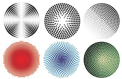
Halftone Printing: Where Realism Happens
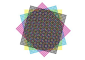
Halftone printing uses tiny dots to simulate gradients and images.
That beautiful image of coffee beans, fresh fruit, or glowing skin on a facial mask package?
It’s not printed directly—it’s built from thousands of microscopic dots.
The finer the dots (higher LPI), the more premium and “photographic” the result looks.
But this is also where problems begin.
The Hidden Problem: Why Your Colors Come Out Darker
Flexo printing is a pressure-based process. And pressure changes everything.
When the printing plate touches the film, the dots don’t stay the same size—they expand slightly. This is called:
👉 Dot Gain
What you see on screen is not what you get on film.
-
A 20% grey in design → can become 30% in production
-
Skin tones → become heavier
-
Gradients → lose detail
👉 Noupack Insight:
This is why experienced suppliers don’t “just print your file.”
They adjust the artwork before production, compensating for dot gain to ensure the final result matches your expectation.
The Most Common (and Costly) Mistake: Combo Plates
To reduce plate costs, some suppliers combine:
-
Solid backgrounds
-
Halftone images
onto a single printing plate.
This is called a combo plate.
On paper, it saves money.
In reality, it creates a technical conflict.

Why It Fails
-
Solid areas need high pressure → to ensure full ink coverage
-
Halftones need low pressure → to preserve dot detail
You can’t optimize both at the same time.
Result:
-
Increase pressure → images become dark and muddy
-
Reduce pressure → solids look weak and uneven
👉 Noupack Recommendation:
For any product that matters to your brand, never compromise on plate separation.
It’s one of the simplest ways to upgrade perceived product quality instantly.
Ink & Drying: The Overlooked Production Risk
Another factor many buyers underestimate is ink volume and drying behavior.
Solid Areas
-
Heavy ink coverage
-
Require full drying before rewinding
-
Risk: blocking (film sticking together)
Halftone Areas
-
Minimal ink
-
Dry quickly
-
Risk: ink drying too fast on the plate → dot clogging & blurred images
👉 Noupack Insight:
This is not just a printing issue—it’s a material + machine + process coordination problem.
Without proper control, even a good design and a good machine can still fail in production.
What This Means for You as a Buyer
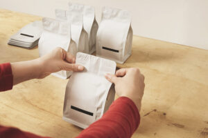
If you are sourcing flexible packaging—especially for:
-
Wet wipes
-
Facial masks
-
Nutritional powders
-
Liquid sachets
Then understanding these basics is not optional. It directly affects:
-
Brand perception
-
Production consistency
-
Cost efficiency (less waste, fewer reprints)
Three Practical Rules to Get It Right
1. Use Solid Printing for Brand Impact
Always ensure your logo and key colors are printed as solids—this defines shelf visibility.
2. Respect Halftone Limitations
Photos and gradients require halftone—but always account for dot gain.
3. Don’t Cut Corners on Plates
Saving a small amount on plate cost can lead to much higher losses in product quality.
Noupack’s Perspective: Where Most Suppliers Get It Wrong
Most packaging suppliers operate in silos:
-
Material supplier → doesn’t understand printing
-
Printer → doesn’t understand machine behavior
-
Machine supplier → doesn’t understand materials
At Noupack, we bridge these gaps.
Because we come from a materials background, we understand:
-
How films react to ink
-
How surfaces affect adhesion
-
How printing parameters interact with structure
👉 This allows us to prevent problems before production starts, not after defects appear.
Final Thought
In flexible packaging, great results don’t come from design alone.
They come from understanding how design, materials, and printing processes interact in real production.
And once you understand the difference between solid and halftone printing,
you’re no longer just buying packaging—
👉 You’re making informed decisions that protect your brand.